Affinity Blog Posts
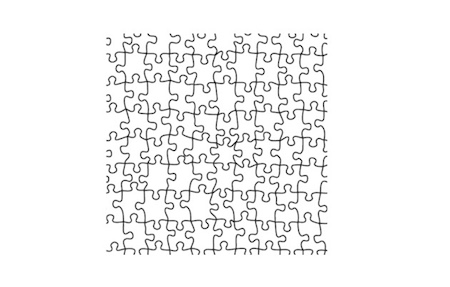
Puzzle Template for Affinity Designer
Puzzles are a great effect to spice up any image. You can remove parts of the puzzle to add a special effect.
I put together an Affinity Designer Template using an old puzzle image that I had in my collection.
Click to download the Puzzle Layer file.
How to Use this
Simply use the puzzle image as the top layer and add your image below it.
If the puzzle image is too small, it's a 512px image, simply duplicate the puzzle layer (Command + J) and then combine the corners. The puzzle pattern is seamless. So you can duplicate and expand any side.
You can change the Layer blending to produce different puzzle effect.
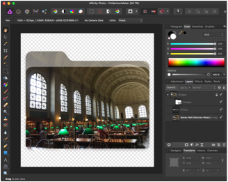
Folder Icon Maker
Having custom folder icons makes searching for content a bit easier. I find it very useful as a top-level folder, so that in a quick glance you know the contents inside of the folder.
There are plenty of tools for Macintosh users to create custom folder icons. A popular custom icon application is Image2icon by Shiny Frog.
I thought it would be useful to have a template for Affinity Designer and Affinity Photo. I would have the ability to use all the cool tools in Affinity to make awesome icons.
Download the Folder Icon Maker Template
I created a template for Affinity Designer and Affinity Photo:
Using the Template
The key thing to remember when using this template is to place your working image/graphic in the same group as the folder icon. In the attached file, there is a picture of 'Bates Hall' in the Boston Public Library. You can see that it in the Folder icon group:
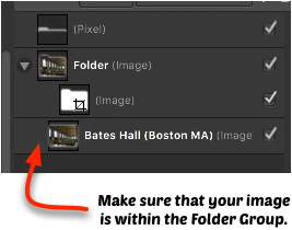
If it's not in the proper group, then the layer clipping will not work properly and the image will take up the entire workspace.
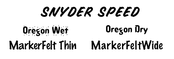
Pat Snyder Font Collection
In the early 1990's Pat Snyder created some cool Postscript Type 1 Fonts.
SnyderSpeed is a Type 1 Postscript font that offers a bold (all caps) typeface duplicating the spontaneous, hand-lettered, brush-stroke used by commercial artists and sign painters to create eye-catching copy for signs, banners, posters, window display cards etc.
OregonWet is a special effects Type 1 PostScript typeface combining the graphic effect of water/raindrops/tears surrounding or splashing near each character. It's a full font containing upper and lower case letters, numbers, most shifted-number symbols and punctuation.
If you have OregonWet (a graphic Type 1 Postscript typeface with the effect of water/raindrops/tears surrounding or splashing near each character), OregonDry is the identical font without the splash effect. It's also a full font with upper and lower case letters, numbers, most shifted-number symbols and punctuation. The fonts can be combined for creative effects for before and after messages. Each stands on its own for display or ad copy.
MarkerFeltThin gives messages urging immediacy a casual, personal touch by looking as if the copy was handwritten with a fine point, felt-tip marker. Use for eye-catching notices, ad display or to convey spontaneous, impulsive expression.
A Type 1 laser printer, upper and lower case font, MarkerFeltWide makes typed copy look like it's been spontaneously hand lettered. MarkerFeltWide gives messages urging immediacy a casual, personal touch by looking like it was made with a wide, felt-tip marker. Similar to MarkerFeltThin, but offering wider stroked letters.
These are the original fonts files:
- Snyder Speed from November, 3, 1991
- OregonWet from November 18, 1991
- OrgonDry from November 18, 1991
- MarkerFeltThin from January 19, 1992
- MarkerFeltWide from March 28, 1992
These fonts might be useful in your Font collection to use when creating flyers or Web graphics in Affinity Designer.
Pat Snyder Font Collection from the 1990s.
You may find some other variations of these fonts online. The links above are the original PostScript Type 1 outline fonts and can still be installed on MacOS Sierra.
I like the MarkerFeltThin and MarkerFeltWide font types, they are a good substitute for Poetsen One and Bluberry Regular fonts.
Other Font's Copied Pat's Style
Someone posted on fontspace.com:
Pat Snyder Today
Pat Snyder isn't working on font's anymore. He is a local artist in Coos Bay, Oregon. You can see some of his latest work on his website: http://www.patsnyderartist.com
Note: These fonts are still considered shareware, I couldn't find any information that they have been made available in the public domain. Registration Information is included in the Zip file of each of the font packages.
Shareware Fees Helped!
Here's a quote from the MarketFelt package:
Since creating my first font SnyderSpeed Brush (11/91 v.1 upper case only), the encouragement of shareware fees and/or input from users, allowed me to update SnyderSpeed by adding lower case (1/92), plus create OregonWet (which made AOL's top November 91 download's list), OregonDry, MarkerFeltThin 2/92, and now MarkerFeltWide (4/92)
Creative use of the OrgonDry and OregonWet
Affinity Designer Stamps
I created 9 different Stamp graphics to use with Affinity Designer. Whenever you need to Approve/Reject something you simply drag the graphic from the Asset panel to your image. These are 100% vector objects so you can resize, change the color and alignment to make it look good.
Download the Stamp Asset Group
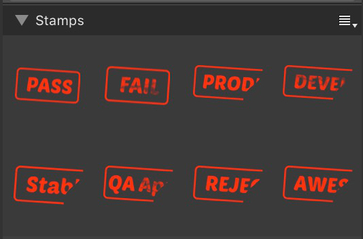
8 Easy Stamps included
- Production
- Development
- Stable
- QA Approve
- Pass
- Fail
- Rejected
- Awesome
Let me know if there any other stamp type that you would like to see. I???ll update the collection based on suggestions by the Internet community.
Better Arrows in Affinity Designer
Affinity Designer doesn't include any line arrows by default. So, I created some using the arrow functionality in Skitch.
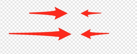
These are all curves types, which means that you easily adjust the shape and the colors. They should look good regardless of the image size. The only problem that I encountered is how Affinity Designer displays the preview of the two arrows that are point to the right a bit weird:
The arrows are there and correct. If you know a better way to make it look good in the Asset panel, let me know!
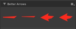
Download the Better Arrows Asset to install it in your Affinity Designer environment.
Stitching Panoramas in Affinity Photo
One of the really nice things I like about Affinity Photo is how easy it to create Panoramas from a set of photos.
Take a look at a couple of photos that were generated from Affinity Photo:
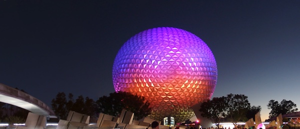
Spaceship Earth at night
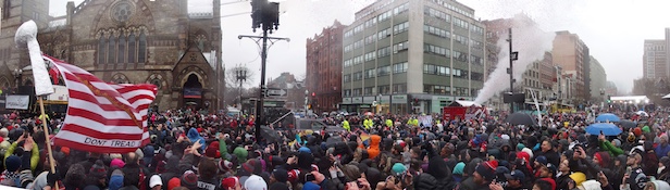
Patriot's Parade in Copley Square.
Creating Panoramas
The first thing to learn about making awesome Panoramic Photos is taking the proper photos. If you don't have a good selection, then your results won't be good.
Four things that I have learned:
- Make sure to take enough pictures that you want to use.
- Have a good overlap between shots
- Keep your camera steady with the horizon.
- Keep the light balance the same between shots.
- Avoid having moving objects such as cars and people in the shots.
Using Panoramic Functionality in Affinity Photo
It's super simple to generate Panoramic pictures:
Prep:
Figure out which photos that you want to use in your Panoramic. I find it easier to create a folder on the desktop and put the photos that I want to use in there.
- Open up Affinity Photo
- Select ???New Panorama..." from the file menu
- Click 'Add' and navigate to the Desktop and select all the photos that you want to use.
- Render the image by clicking on 'Stitch Panorama'
- Do a quick check and make sure the finish product looks good in the preview.
- Click on the Crop icon, and in the top toolbar look for 'Crop to Opaque.' (It's on the far right of the toolbar.) This will give you the best crop for your image.
- Use the Inpainting Brush to fix any gaps.
If you find that your cropping large areas of your photo, you need to learn the fundamental of taking good panoramic photos: keeping the horizon the same in all your shots.
Affinity Photo recommends to use a tripod to take panoramas, but that's not always easy to do. Once you learn how easy to create Panoramas in Affinity Photo you'll be thinking twice when taking pictures on your next vacation.
Why not just use iPhone Pano?
The key reason of using Affinity Photo over the built in Pano on the iPhone is that you have a lot more flexibility. You can modify the pictures before stitching them together, fix the horizon and much more.
Affinity Designer Calendar Template
I was putting together some calendar design in Affinity Designer for project planning. I couldn't find an easy way to create a grid calendar. I checked various Affinity Designer template sites and didn't see any 2017 Calendars that allowed customizations.
So, I decided to use some of the functionality in OmniGraffle Professional and design March and April 2017. I then imported the table into Affinity Designer and added some styles and grouping:
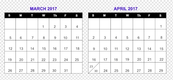
Download the Affinity Designer Calendar Template.
If you have Affinity Designer, feel free to download my template file and customize it for any type of planning that you want to do.
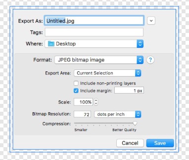
OmniGraphic Margin Functionality
When you export a graphic in OmniGraphic, you can optionally add a margin to the image. This adds a small transparent margin around the image. This is useful if you include the graphic in an email and would like a small margin so the text doesn't cram up to the image.
Web Developers can always add a style class so that image floats on the page, but you don't always have that control in some applications.
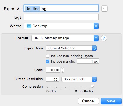
OmniGraffle Export Dialog box
What about Affinity?
In Affinity Designer and Affinity Photo there is no option in the Export Persona or File->Export mode.
You can easily achieve this functionality in Affinity Designer and Affinity Photo. You simply create a style to add a transparent border around your object.
Create a Outer Shadow Effect:
|
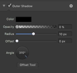
|
You won't see anything when you apply this to an object, but when you switch to the Export Persona, you will see an extra border around the image. This is to show you that the extra space that you added.
In Export Persona mode there is an indicator that there's more to the image than meets the eye.
Designer Tip
Created a couple of Styles with different radius to make it easier when you want different size margins around your image.
Memes in Affinity Designer
If your looking to create MEME in Affinity Designer or Affinity Photo here's some useful information.
Example of a typical MEME

There are lots of online services to create MEME such as IMGUR and imgflip, Memegenerator.net. The sites typically have all the standard images you seen in MEME.
If you have Affinity Designer or Photo you already have a powerful tool to create MEMEs.
The ideal Font font to use is Impact, with some black border. The font size varies on the length of the text.
Memes Asset
To make life easier, download the Memes Asset that I created.
Download Memes Assets for Affinity Designer.
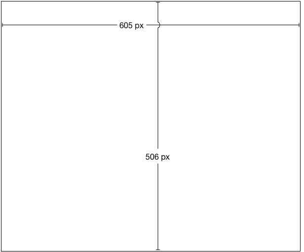
Ideal MEME size
The ideal MEME size is 604 by 506, depending on the graphic and the source. But it can be any size that you want. I created this useful graphic to help you create a typical Meme:
There's a template in the Memes Asset too. I'll update the Asset as I think of other things that seem appropriate.
Have fun making cool Memes.
Affinity Photo Dust and Scratches
One of the cool features that I like in Affinity Photo is the 'Dust and Scratches' filter. This has been a time saver in touching up some old photos that were scanned in.
I am putting together a slide show of old pictures for a 50th birthday party. Many of the old photos from the 1960s and 1970s weren't stored right and as results have little specs on them. They aren't really noticeable until you look at the photo after scanning them in.
After I touch up the photo and use Auto White Balance and Auto Levels, I then apply the 'Set and Scratches' feature.
Basically the Dust and Scratches adds a bit of a blur to the photo. It's a quick way to clear up the white dots, but it can make the photo look different, which is why it's important to only apply a small radius.
Not in Pixelmator
Last year, while working on a different photo project, I used Pixelmator's Repair Tool to clean up photos with the scratch. It worked great, but there were a few photos where there were a lot of small dust. I ended up skipping a lot of the smaller dust because it wasn't worth the time or effort.
Available in Photoshop Elements
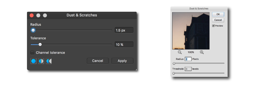
The features isn't exclusive to Affinity Photo, you can easily remove Dust and Scratches in Photoshop Elements - and I assume Photoshop too.
Photoshop Element adds a zoom in feature which makes it a bit easier to see what happens if you have large radius.
Today I Learned
My advice is to apply a very small Dust and Scratches radius, just enough so that a lot of the smaller white dots are gone. Then use the 'Inpainting Brush Tool' to get some of the bigger dust and scratches.
Also it's a good idea to make a copy of the photo that you are retouching. Technology is always changing. There might be an easier way to clean up the photo, and you don't want to have to rescan the original photo to take advantage of the technology.