macOS Ventura
First Impressions
The latest Macintosh OS, Ventura, was installed on Monday. The installation went smoothly and fairly quickly. After the installation, my first impression was - Now What? I didn't notice any major changes to the Finder.
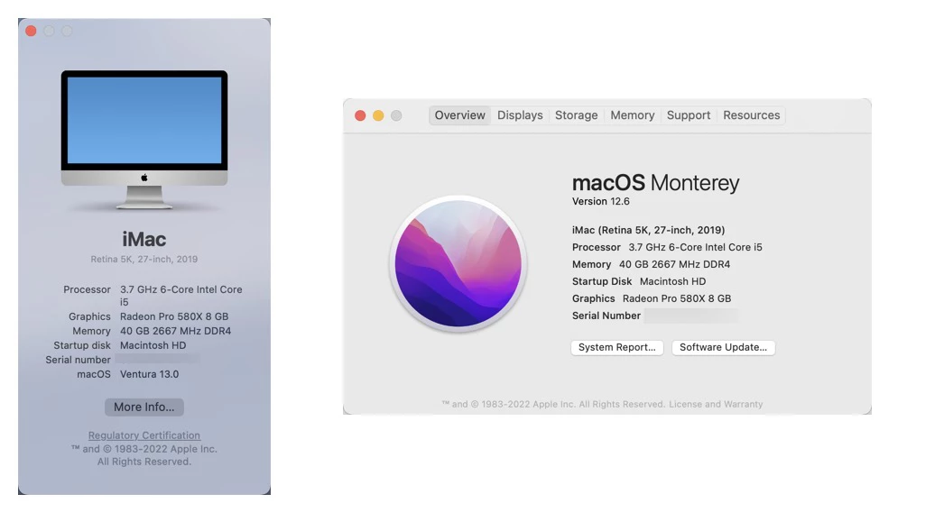
The first noticeable change was to the About Macintosh box. It has certainly changed a lot:

About this Computer dialog box is much smaller. The old box looks like marketing, the new box looks like it was done by engineering.
Five First Impressions
Easy Install - The installation was very easy, the only thing I had to do post-installation was to reinitiate some application permissions. I had to reinitiate the screen capture permissions on Snagit.
System Settings - The Systems Settings dialog box is nice and clean. This change reminds me of when Bare Bones change the BBEdit preferences box. The settings box has gotten so complex, that most people just search for the feature they are looking for.
Spotlight Search improvements - Searching for images has improved. Its nice to search for text within images. I would like the option to prioritize certain categories. I am likely to search for things on my computer, I don't want Safari History to be the first item on display - I would like to lower that category.
Stage Manager - I played around with one of Ventura's newest feature - Stage Manager. Stage Manager puts other open apps on the left side of the screen where it's easy to access. I can see this would be something useful when you're switching around applications - especially if you only have one display connected to the computer. This is a functionality that I'll have to get used to.
Upgraded Snagit to 2023 - On Thursday, TechSmith announced the new version of Snagit. There weren't any issues using Snagit 2022 on Ventura, but since I qualified for the upgrade I decided to upgrade to get the latest and greatest features.
