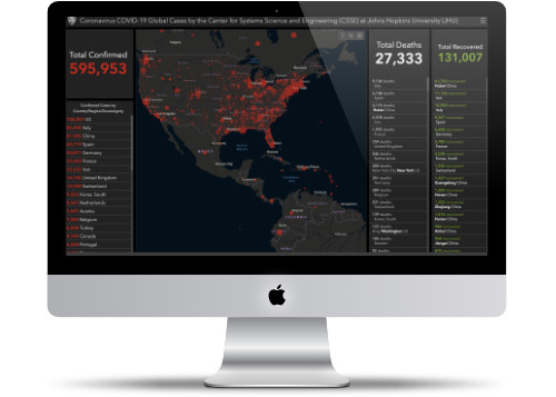
Coronavirus COVID-19 Dashboard
Watch the numbers change on this popular interactive dashboard.
The "official" dashboard that the Center for Disease Control and the World Health Organization uses is the one at the Johns Hopkins University (JHU). It's a simple one-page view of how fast the virus is spreading throughout the world.
You can view the World View or select a particular country to monitor the numbers. As soon as local officials report update the page automatically gets updated.
Website Description
In response to this ongoing public health emergency, we developed an interactive web-based dashboard (static snapshot shown above) hosted by the Center for Systems Science and Engineering (CSSE) at Johns Hopkins University, to visualize and track reported cases in real-time. The dashboard first shared publicly on January 22, illustrates the location and number of confirmed COVID-19 cases, deaths, and recoveries for all affected countries. It was developed to provide researchers, public health authorities and the general public with a user-friendly tool to track the outbreak as it unfolds. Further, all the data collected and displayed is made freely available, initially as google sheets, now in a GitHub repository, along with the feature layers of the dashboard, which are now included in the ESRI Living Atlas.
 https://www.arcgis.com/apps/opsdashboard/index.html
