Rediscovering the eWorld Font
A Journey Through Apple's Lost Typeface
As a tech enthusiast and font aficionado, I recently embarked on a nostalgic journey that led me to unearth a piece of Apple's forgotten history: the eWorld font. This elusive typeface, once integral to Apple's short-lived online service in the mid-1990s, has become something of a digital artifact. Today, I'm sharing my adventure in attempting to resurrect this piece of typographic history.
The Discovery
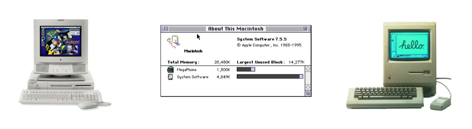
It all started when I managed to get my hands on an original installation floppy disk containing the eWorld font. The date stamp on the font file read April 28, 1994. Excitement coursed through me as I held this piece of Apple's past in my hands. Also on the floppy disk were Monoco (May 16, 1994) and Palatino (May 111, 1994).
The Challenge
However, my initial enthusiasm was quickly tempered by reality. Despite having the font file, I found myself unable to install it on my modern system. It was a stark reminder of how quickly technology moves forward, often leaving behind compatibility with older software.
A Glimpse into the Past
Undeterred, I turned to my trusty G4 computer - a relic in its own right, but newer than the eWorld era. While I couldn't install the font, I was able to preview it.
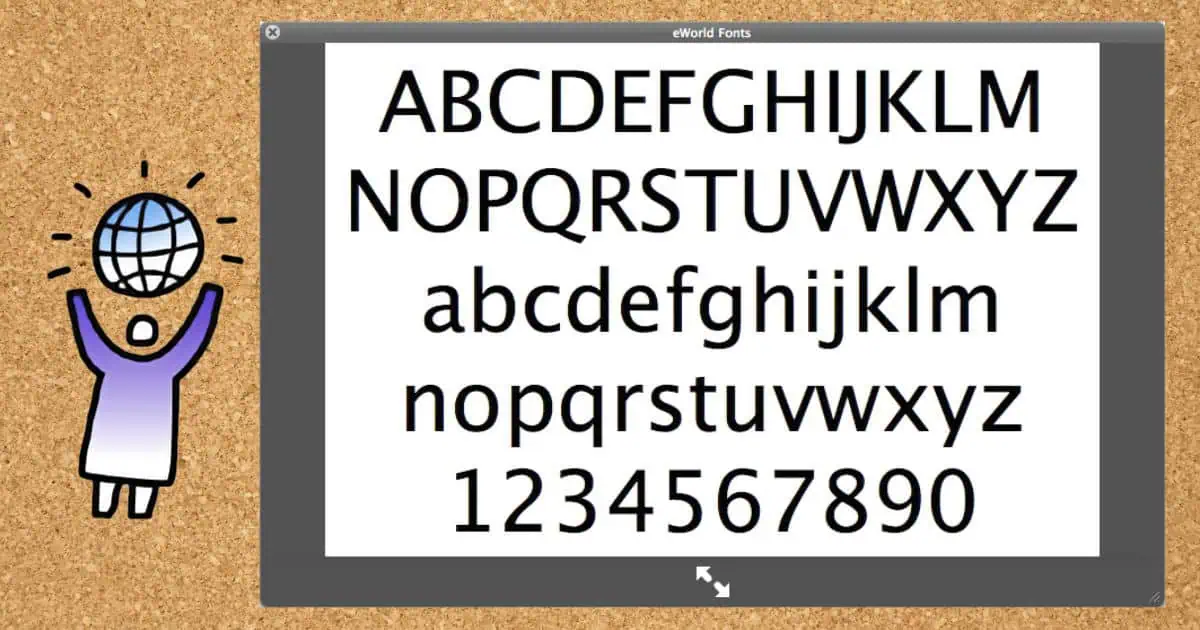
Looking at the preview, I was struck by the font's clean lines and friendly appearance. It exuded a sense of approachability that was characteristic of Apple's design philosophy at the time.
Modern-Day Equivalents
Intrigued by what I saw, I began comparing the eWorld font to other typefaces in my collection. To my surprise, I found that two fonts bore a striking resemblance to eWorld:
- Lucida Grande
- Apple Symbols
These fonts, which have been staples in Apple's typographic arsenal for years, seemed to carry the DNA of their eWorld predecessor. It was fascinating to see how Apple's font design had evolved while maintaining certain core aesthetic principles.
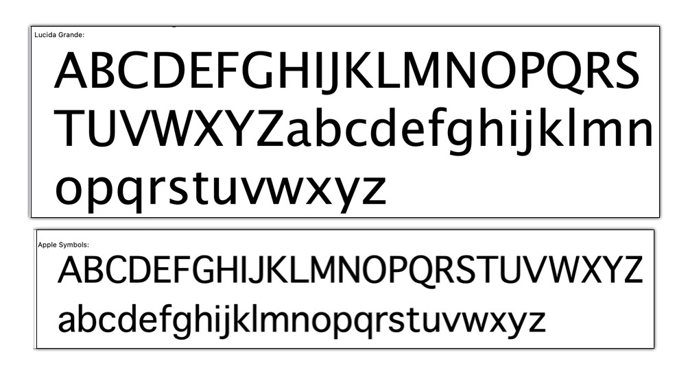
Lucida Grande and Apple Symbols are very similar to the eWorld Font.
The Legacy of eWorld
While the eWorld online service was short-lived (1994-1996), its font appears to have had a lasting impact on Apple's typography. The similarities between eWorld and more recent Apple fonts suggest that the design principles behind eWorld - clarity, friendliness, and ease of reading - continued to influence Apple's typographic choices long after the service itself was discontinued.
Reflections
My journey with the eWorld font, from the excitement of discovery to the challenges of compatibility, serves as a reminder of the rapid pace of technological change. It also highlights the importance of digital preservation. Fonts, like other software, can become casualties of progress, existing only in the limbo of outdated file formats and incompatible systems.
For designers and tech historians, fonts like eWorld are more than just letters on a screen. They're windows into the aesthetic and functional priorities of their time. They tell us about the technology available, the design trends in vogue, and the ways in which companies like Apple sought to present themselves to the world.
Conclusion
While I may not have been able to fully resurrect the eWorld font, this experience has given me a deeper appreciation for the evolution of digital typography. It's a reminder that behind every letter we type is a rich history of design, technology, and cultural shifts.
For those interested in typography or Apple's history, I encourage you to look beyond the fonts we use every day. There's a whole world of forgotten typefaces out there, each with its own story to tell. Who knows what other typographic treasures are waiting to be rediscovered on old floppy disks and CD-ROMs?
Have you ever stumbled upon an old font or piece of software that fascinated you? I'd love to hear about your experiences in the comments below!