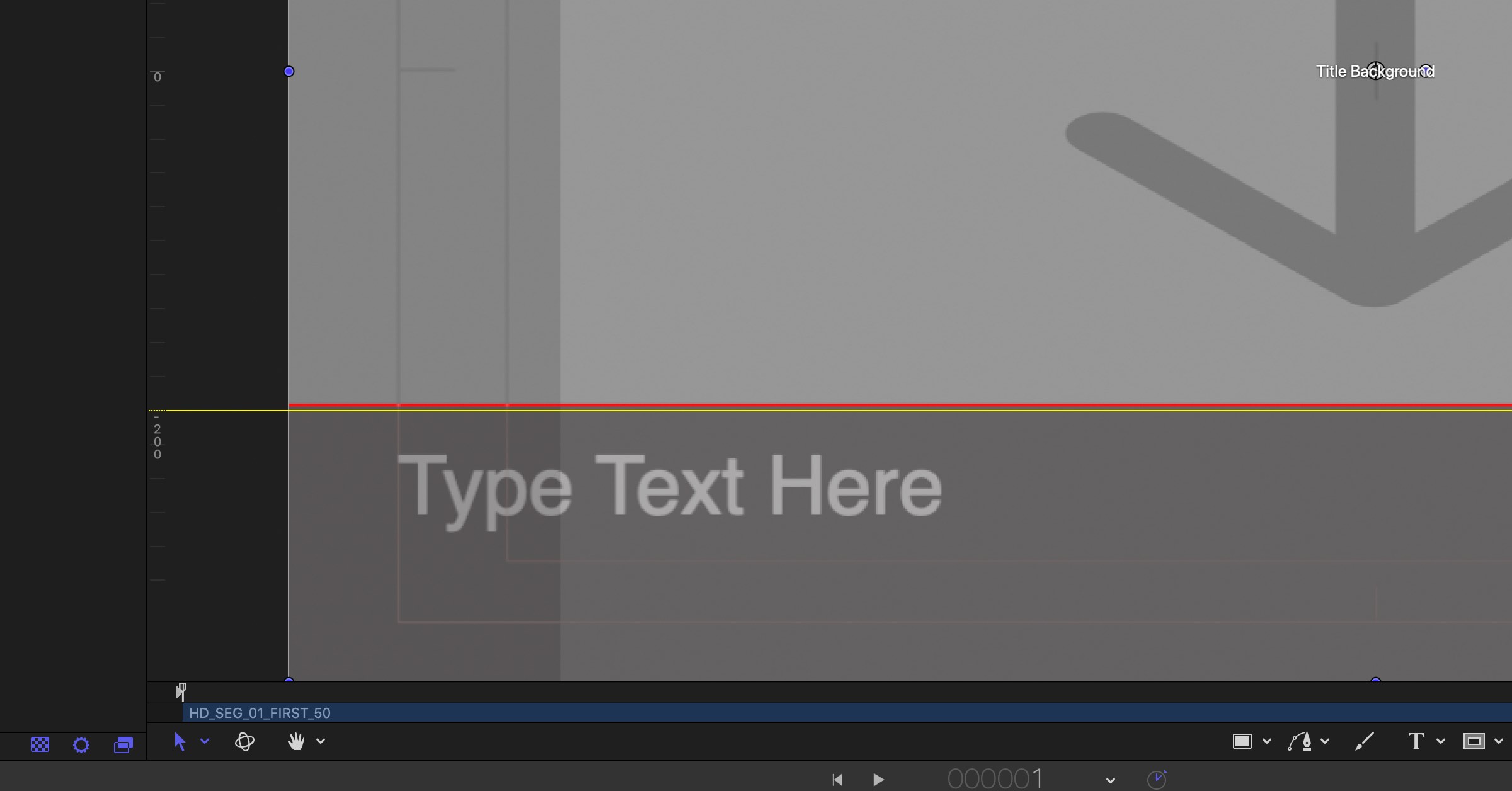
Lower Third Overlay
Comedy Central has a guide on where to place the lower third.
If your building your own lower third from scratch, you may want to have an overlay guide to help you align text correctly.
I found the image overlay on Comedy Central to be very useful to properly laying out the lower third title. The image overlay has a logo placement helps to professionally align a logo on the bottom right of the screen.
Basically you add this image to your Title project and align your lower 3rd correctly. Once you are done simply remove it from your project.

Steps to Add the Overlay in Motion
- Download the file from the Comedy Central's overlays website
- Open up any Final Cut Pro Title Project
- Import the overlay. (You'll see that the overlay fits perfectly into a standard 1920x1080 format.)
- You may need to move the Overlay layer below the text layer.
- Now adjust the text layer so that its below the lower third line.
- Hide the Comedy Central overlay image and continue working as normal.
Don't want to use the guide?
Simply turn on the ruler and look for the 200 on the left side. (See the above screenshot)
