Better Arrows in Affinity Designer
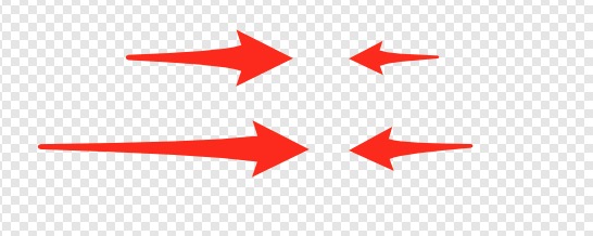
Affinity Designer doesn't include any line arrows by default. So, I created some using the arrow functionality in Skitch.

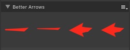
These are all curves types, which means that you easily adjust the shape and the colors. They should look good regardless of the image size. The only problem that I encountered is how Affinity Designer displays the preview of the two arrows that are point to the right a bit weird:

The arrows are there and correct. If you know a better way to make it look good in the Asset panel, let me know!
Download the Better Arrows Asset to install it in your Affinity Designer environment.
