
Quality Assurance Image Library
This is my carefully curated collection of Slack images, designed to perfectly capture those unique QA moments. Whether it's celebrating a successful test run, expressing the frustration of debugging, or simply adding humor to your team's chat, these images are here to help you communicate with personality and style.
The Inquiry Method for Test Planning
The Inquiry Method for Test Planning is a process that helps you plan your tests by identifying and investigating the test objectives. This method can be used to develop both formative and automated assessments.

To use the Inquiry Method for Test Planning, you first need to identify the test objectives. These are specific goals that you want test cases to achieve as a result of running your test. Next, you need to investigate how best to assess each objective. This involves thinking about what type of question or activity will best measure the test cases - understanding of the objective. Finally, you need to create a plan for running the tests and scoring the final responses.
The Inquiry Method for Test Planning is an important tool for creating effective release risk assessments. By beginning with clear objectives and then investigating how best to measure the release success, this process ensures that tests reflect what developers have implemented in the release. Additionally, using an inquiry-based approach allows QA the flexibility in developing assessment items customized to their own test case goals and needs."
![]() Filed under the Quality Assurance category. [Permalink]
Filed under the Quality Assurance category. [Permalink]
Sprint Velocity
Velocity is one of the most important measures of success in agile development. The higher the velocity, the more software functionality a team can deliver, and the more value is created for customers. However, there are many factors that can affect velocity, so it's important to track it carefully and adjust as needed.
There are several ways to measure velocity: in story points, hours, or ideal days. Some teams prefer to use story points because they're relative and don't depend on how long something takes to complete. Other teams prefer to use hours or ideal days because they're more specific and easier to track.
No matter which method you choose, it's important to keep track of your team's velocity over time so you can identify any trends or changes that might be affecting your ability to deliver value for your customers

Things I Learned
Velocity is a measure of how much the team can complete in an iteration. It is generally measured in terms of the number of user story points completed in a sprint.
The higher the velocity, the more work the team can complete. This allows for shorter iterations and faster feedback cycles, which leads to better products.
While velocity should not be used as the only metric for determining whether or not a team is successful, it is an important indicator that should be tracked over time.
Velocity is not useful as a team measure until you have completed at least three sprints with a fixed team of people.
Sprint retrospective meetings should always focus on ways to improve the team's velocity.
Things to Consider at a Retrospective Meeting
Three good questions to ask:
- Is the team delivering at maximum velocity?
- What is slowing down the team to deliver more quality code?
- What can the team do differently to improve velocity?
![]() Filed under the Quality Assurance category. [Permalink]
Filed under the Quality Assurance category. [Permalink]
BugWalk
If your looking for a fun way to learn JavaScript, try BugWalk. This simple JavaScript will add bugs to any website.
Developers can make all sorts of adjustments such as; the amount of time the bugs appear, the speed of the bugs, mouseover effects, and more.
How Can You Learn from This?
QA Developers can manipulate the JavaScript file and learn various parts of JavaScript. This is also useful to learn how to use JavaScript with sprite.
To get started, download the project from GitHub and start playing around with it. The nice thing is that you don't need to be connected to the internet to play around with the project.
![]() Filed under the Quality Assurance category. [Permalink]
Filed under the Quality Assurance category. [Permalink]
XPath Validation
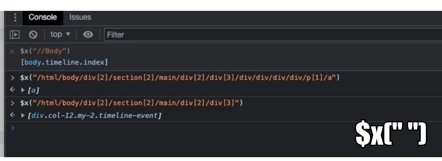
Selenium automation requires getting the XPath to find elements on the page. There are all sorts of third-party tools that can help make the process easy. Did you know that Chrome and Firefox have a built-in tool that can show you the value of a given XPath?
Discovering the Value of a Given XPath
There is a hidden variable: $x while echos the content of given XPath. Example Use:
$x("//BODY")
Four Things I Learned
In Chrome, If you just type in "$" in the console, you'll see all the available commands. However, Google doesn't show $x in that list. Firefox does show that $x is a valid variable.
The $x XPath Validation is very useful to discover the value of an object. Especially useful when automation is trying to click on something and it's not working. This is also useful when running automation against different browsers - you can see the different XPATH values each browser takes.
I have used this after an automation failure, with the browser still open, I would open the console and then use the $x to see the value of that location.
In Chrome, When you mouse over the 'i" the selected area is highlighted. In Firefox it's the cog icon.
![]() Filed under the Quality Assurance category. [Permalink]
Filed under the Quality Assurance category. [Permalink]
Canned Responses in Jira
Canned Responses in Jira is a powerful feature that can save you time and improve your productivity. It allows you to create and store reusable responses for common tasks, such as creating issues, assigning them to someone, or commenting on them. This can be a huge time-saver if you need to respond to the same types of issues frequently.
To create a canned response:
- In the issue's Quick Actions menu, select Create Canned Response...
- Enter your response text in the editor window and click Save .
- The canned response will now appear in the list below. You can edit it at any time by clicking its name. To use it in an issue, just type $ followed by its name (e.g., @$yCannedResponse).
This is useful for QA to create custom responses to testing results. This helps maintain some stability in the testing results.
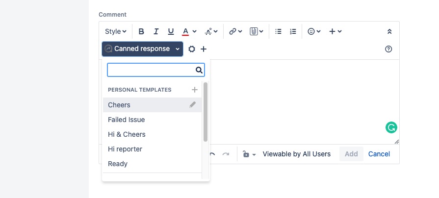
Sample of where the Canned Reponse is in the comment text dialog box.
Some Example Canned Responses
| Issue Ready
*Ready:* Tested using the react app on the QA Server with the latest $issueKey$ branch (/) Validated that |
| Failed Issues
Hey $assigneeFirstName$, I found an issue testing this issue. |
| Any Testing Steps?
How should QA test this ticket? Do you have a case study so we can validate this functionality? What are the risk points? What are the expected results of going to each environment? |
![]() Filed under the Quality Assurance category. [Permalink]
Filed under the Quality Assurance category. [Permalink]
Release Engineer Queue Boss
Back in 2011, I wrote up the need for an Engineer Queue Boss. This is a short follow-up to that post. (Things have changed in the 11 years since I posted it.)

An Engineer Queue Boss is someone that handles any issues that Quality Assurance or Customer Support finds. The purpose of this position is to take the load off other engineers so they can focus on their tasks and not be distracted by current issues.
The Engineer Queue Boss needs to have a strong understanding of how the product works, as well as the ability to communicate with both customers and engineers. They need to be able to prioritize tasks and work with other teams in order to get things done quickly and efficiently.
The Engineer Queue Boss will work with the rest of the team to triage and prioritize production release issues, then work to resolve them as quickly as possible. They must have excellent communication skills, be able to effectively manage their time, and have a strong understanding of how the software works.
This position is essential for keeping engineers focused on their tasks and ensuring that customer support and quality assurance are able to do their jobs without being overwhelmed by current issues.
![]() Filed under the Quality Assurance category. [Permalink]
Filed under the Quality Assurance category. [Permalink]
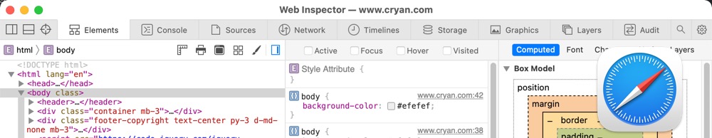
Dev Tools Screen-shot
People use different browsers for various reasons. Some people like the privacy feature of Firefox, while others like the way things are bookmarked in Chrome. Still, others prefer Safari because it is a MacOS default browser. Finally, some people use Edge because it is the newest browser and Microsoft is pushing it as their flagship product.
Occasionally I'll get a screenshot of the Developer Tools in a ticket and I can't figure out what browser they are using. Is it Chrome? Firefox?
Should I ask? Maybe I should know based on the screenshot?
Here's a visual reference of Chrome, FireFox, Edge and Safari. This should help figure out which Developer Tool is being used.
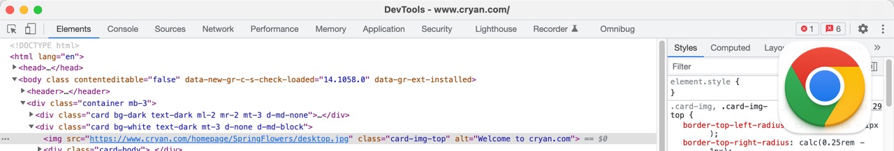
Chrome (MacOS)
Apple Safari
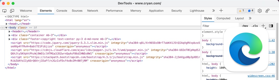
Microsoft Edge
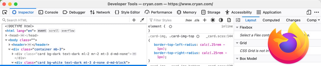
FireFox
![]() Filed under the Quality Assurance category. [Permalink]
Filed under the Quality Assurance category. [Permalink]
Volume Testing
Volume testing is a type of software testing that determines the system's ability to take data in large volumes. This type of testing is often used to test the performance and scalability of systems, as well as their ability to handle peak loads. Volume tests can be conducted on both live and simulated data sets, depending on the needs of the organization.
One key consideration when conducting volume tests is determining how much data to use. Too little data may not accurately reflect real-world conditions, while too much data can overwhelm the system and make it difficult to perform accurate tests. Additionally, testers need to ensure that they are simulating realistic user activity patterns when generating test data.
When volume testing is complete, organizations should have a good idea of how their systems will perform under high traffic loads. This information can help inform decisions about system architecture and capacity planning going forward.
There are a number of tools and techniques you can use for volume testing:
- Load Testing Tools: These tools help simulate heavy user loads on systems by sending requests at specific intervals and measuring response times.
- Data Generation Tools: These tools create realistic test data sets that accurately represent actual customer behavior.
- Transaction Simulation Tools: These tools allow testers to model complex business processes using virtual customers.
![]() Filed under the Quality Assurance category. [Permalink]
Filed under the Quality Assurance category. [Permalink]
Pet Testing
Debugging code can be a difficult process, but luckily there are a few tricks that can make it a little bit easier. One popular technique is called rubber duck debugging. This approach involves explaining the code to a rubber duck (or some other inanimate object). By vocalizing your thoughts and walking through the code step by step, you can often find and fix errors more easily.
This method has been shown to be surprisingly effective, even for experienced developers. In fact, one study found that programmers who used Rubber Duck Debugging were able to solve problems 34% faster than those who didn’t use the technique. So if you’re struggling with a particularly tricky bug, give rubber duck debugging a try – you might be surprised at how well it works!
For QA, I submit a new concept of Pet Testing.
As a QA Engineer, you conduct testing by explaining the testing logic to your pet. Basically, you would be talking to the pet to explain why you are testing a certain area. This allows for a clear understanding of what is being tested and why. In this way, pets can be an effective tool for quality assurance.
One common use case for this technique is when testers are trying to verify that an application behaves as expected under different conditions. Explaining your tests to a pet can help ensure that all potential scenarios are considered and accounted for. Additionally, it can help identify any potential issues with how the application is being tested or with the test plan itself.
Of course, using pets as part of your QA process requires some extra effort on your part – but the benefits can be worth it! By taking the time to communicate with your pet about why you’re doing each test, you create an additional layer of clarity and communication around your work – and that’s always good news for quality assurance
Spawns Other Pet-Type Testing Terms
This could spawn off other type of pet testing terminology, such as:
Aardvark Testing - Aardvark Testing is a process for identifying and fixing defects or errors in a software program. It is used to determine whether a particular type of bug exists in the software. Aardvark Testing can be used to find bugs in the code, design, requirements, or documentation.
Aardvark Testing is named after an animal that eats termites. Just as the aardvark eats termites, Aardvark Testing eats bugs. The name was chosen because it is easy to remember and fun to say.
Rabbit Testing - Rabbit testing is a process of verifying the quality of software products and services through rapid and repetitive execution of tests. It helps to identify defects early in the software development life cycle, which reduces the cost and time required for their correction. Quick testing is an efficient way to ensure that high-quality products are delivered to customers.
The goal of quick testing is to identify problems quickly so that they can be fixed before they cause serious damage. Quick tests can be run on every build, allowing developers to find and fix problems as they occur. This approach helps reduce the number of defects that make it into production, improving the quality of the final product.
Sloth Testing - Slow down and take your time testing. Make sure to test all the fundamentals of the application - but go slow. This is a good time to add bandwidth throttling to see how the site performs when service is slow. Testing under load conditions can help identify potential problems and bottlenecks in your system before they become real issues for customers.
Sugar Glider Testing - Sugar Gliders are nocturnal animals that spend the majority of their time active at night. This makes them a perfect subject for black-box testing, as they will not be disturbed by the testers. Black box testing is a type of software testing where the inner workings of the software are unknown to the testers. This allows for unbiased and accurate results. Sugar gliders have been used in black-box tests in Europe for over a decade with great success. The use of sugar gliders in this type of testing is humane and provides valuable information about how the software works under different circumstances
![]() Filed under the Quality Assurance category. [Permalink]
Filed under the Quality Assurance category. [Permalink]
jQuery Techniques
jQuery is a powerful JavaScript library that helps make web development easier. In addition to its many features, jQuery also includes a number of tips and tricks that can be useful for quality assurance developers. Some of these tips include using the .each() function to loop through arrays and objects, using the .filter() function to select specific elements from arrays or objects, and using the .map() function to create new arrays based on existing arrays. These tips can help make your code more efficient and easier to read, which can lead to better quality assurance results.
Quality assurance (QA) software testing is an important process in the development of any software application. By using jquery, you can make your QA testing process easier and more efficient.
jQuery is a JavaScript library that simplifies the process of writing code for web applications. It provides a wide range of features, including DOM manipulation, event handling, animation, and Ajax interactions. This makes it perfect for use in QA software testing.
jQuery can be used to test all aspects of an application's functionality. You can use it to simulate user interactions with the application, test its performance under different conditions, and verify that its output is correct. In addition, jQuery's cross-browser compatibility means that you can be confident that your tests will work on all major browsers.

Check to see if JQuery exists
This is a simple command to see if a particular site is using jQuery:
Open the Chrome DevTools console: Option-Command-J
console.log(jQuery().jquery);
If Successful:
3.5.1 -ajax,-ajax/jsonp,-ajax/load,-ajax/script,-ajax/var/location,-ajax/var/nonce,-ajax/var/rquery,-ajax/xhr,-manipulation/_evalUrl,-deprecated/ajax-event-alias,-effects,-effects/Tween,-effects/animatedSelector
If Failed:
VM35:1 Uncaught ReferenceError: jQuery is not defined
    at :1:9
Add jQuery via Console
This is a simple command to add jQuery to any website via the Chrome Console::
var jq = document.createElement('script');
jq.src = "https://ajax.googleapis.com/ajax/libs/jquery/3.5.1/jquery.min.js";
document.getElementsByTagName('head')[0].appendChild(jq);
Now you can easily run your favorite jQuery commands, such as this one to check for the presence of IDs. This is an example code snippet to show IDs that don't have names:
$('*:not([id]):not([class])').css("border","2px solid red");
![]() Filed under the Quality Assurance category. [Permalink]
Filed under the Quality Assurance category. [Permalink]
About
Welcome to QA!
The purpose of these blog posts is to provide comprehensive insights into Software Quality Assurance testing, addressing everything you ever wanted to know but were afraid to ask.
These posts will cover topics such as the fundamentals of Software Quality Assurance testing, creating test plans, designing test cases, and developing automated tests. Additionally, they will explore best practices for testing and offer tips and tricks to make the process more efficient and effective
Check out all the Blog Posts.
Blog Schedule
| Sunday | Open Topic |
| Monday | Media Monday |
| Tuesday | QA |
| Wednesday | Veed |
| Thursday | Business |
| Friday | Macintosh |
| Saturday | Internet Tools |
Other Posts
- Why QA
- QA Halloween Testing
- 10 Tips for Effective Testing with Deadlines
- QA Fail: Storrowing
- Pytest vs Playwright vs Cypress
- Never Under Estimate the Value of Testing
- QA Release Checklist
- Making Evidence Base Decisions
- Adobe Flash
- Negative Test Cases
- Prevent Problems: They Are Hard to Fix
- Dragnet and QA
- Test as you fly, fly as you test
- Jira Short cuts for QA
- Cat Testing