
Quality Assurance Image Library
This is my carefully curated collection of Slack images, designed to perfectly capture those unique QA moments. Whether it's celebrating a successful test run, expressing the frustration of debugging, or simply adding humor to your team's chat, these images are here to help you communicate with personality and style.
World Quality Day

World Quality Day is Thursday, November 10, 2022
World Quality Day is a day to celebrate the importance of quality in our lives. It is celebrated annually on November 10th. This year, World Quality Day falls on a Thursday, so we can all take the time to appreciate the role that quality plays in making our world a better place.
Quality is something that we often take for granted, but it is essential to our lives. From the food we eat and the water we drink to the clothes we wear and the homes we live in, everything around us depends on quality control. Without it, life would be very different - and much less comfortable!
On World Quality Day, let's pledge to do our part in ensuring that products and services are of high quality. We can start by paying attention to detail and demanding only the best from ourselves and others. By doing so, we can make sure that everyone benefits from improved standards of living - now and into the future.
QA Halloween Testing
As Halloween approaches, it's time for Quality Assurance Management (QA) to get their spook on! That's right, it's Halloween testing season!
As you may be aware, Halloween is the scariest holiday of the year. What better way to test your software than by subjecting it to the scariest holiday of the year? By putting your software to the test during Halloween, you can be sure that it will be able to handle anything that is thrown at it.

What kind of tests should you be running during this spooky season? Here are some suggestions to get you started:
Stress Tests - Can your software handle being bombarded with requests? Make sure it can stand up to the onslaught of traffic by running stress tests. This is especially important if you're expecting a surge in traffic due to seasonal promotions or sales.
Security Tests - Is your software secure against all kinds of attacks? With all the ghosts and goblins out there, now is the time to find out! Run security scans and penetration tests to make sure your data is safe from harm.
Functionality Tests - Does everything work as intended? There's nothing worse than finding out too late that something doesn't work properly. Put your software through its paces with comprehensive functionality testing prior to launch day.
Compatibility Tests- Will everything play nice together? If you're launching new features or integrations, make sure they don't break anything else in the process by running compatibility tests across all browsers and devices .
Usability Tests- Is everything easy enough for users? No one wants a complicated user experience, least of all during such a hectic holiday season! Test how easy (or difficult ) it is to use key features in order to ensure users have a positive experience.
QA teams can rest assured knowing that their systems are ready for whatever Halloween brings!
Usability Testing

Usability testing is a critical part of quality assurance testing. By definition, usability testing is "a type of evaluation conducted to determine how easy, convenient, and effective a product or system is to use." In other words, it's all about making sure your users can actually use your product or service as intended.
There are many different ways to go about conducting usability tests. One popular method is called "think-aloud protocol," in which testers are asked to think out loud while using the product or service under test. This helps researchers understand not only what users are trying to do with the product, but also why they're doing it. Other methods include eye tracking (which can show where users look on a screen while using a particular website or app), focus groups (in which small groups of users discuss their experiences with a given product), and surveys (which can be used to collect data from large numbers of users).

No matter what method you choose, there are some key things to keep in mind when conducting usability tests:
- Make sure you have clear objectives for each test. What exactly do you want to learn? How will this information help improve the user experience?
- Recruit participants who represent your target audience. It's important that the people you're testing with are representative of those who will actually be using your product or service in the real world.
- Give testers specific tasks to complete during the test; don't just let them loose on your site or app and see what happens! This will help ensure that you get useful data from each session.
- Be prepared to take action based on what you learn from the tests. Usability testing should never be an exercise in futility--if something isn't working well for users, make changes!
How Sketchnoting Can Help You Test Better
How many times have you and your team sat in a meeting together and discussed something that could be tested? How many times have you huddled together over a whiteboard with marker in hand to test some aspect of your user experience or customer journey? How many times have you tested something only to find out that it didn’t work? Testing is hard. It takes time, energy, and effort. If you’re like most people, though, it’s not your favorite thing to do. It’s interesting enough as a concept but in practice, it can be monotonous and frustrating. Luckily, there are ways to make testing easier without sacrificing quality or impact. One technique that has been showing up more frequently among software developers is called sketchnoting. While it might sound cryptic and unrelated to software testing, the principles of sketchnoting can be used as an effective tool for testing product logic, user flows, and user experiences.

What is Sketchnoting?
Sketchnoting is a visual note-taking technique that combines sketching and note-taking. With sketchnoting, you use visuals to help you remember information. Visuals can be sketches, diagrams, charts, graphs, and other visuals you can use to visually represent data or content. Sketchnoting is a great way to organize your thoughts when taking notes. It also helps you to better recall the information you’ve written down. Sketchnoting can be done with pen and paper, whiteboards, or a combination of the two. It does not need to be elaborate; it can be as simple as drawing shapes and arrows to connect ideas. When taking notes, your goal is to record the key points or main thoughts that are relevant to the discussion.
How Can Sketching Help You Test Better?
Sketchnoting is a powerful tool that can help you test better by helping you organize your thoughts, visually represent important data, and give your team a common language of ideas and concepts. You can use sketchnoting to organize your thoughts around test ideas, user flows, and product concepts. Visuals can help you quickly identify gaps in your ideas and instantly see how they might affect other concepts. Sketchnoting can also be used in the testing process to represent data relevant to a test visually.
Benefits of Sketchnoting for Testing
Visuals help you better retain information - - Visuals create a connection in your brain that more closely links information with imagery. This makes it easier for your mind to recall information. Visuals inspire collaboration - - Having visuals on your whiteboard or in your notebooks can help encourage collaboration and facilitate conversation. Visuals help build understanding - - Visuals can be used to help you build common understanding and create a shared vocabulary among your team. Visuals can also be used to help stakeholders better understand the product by representing data and user flows in a visual way. Visuals help you notice gaps and inconsistencies - - Visuals can help you identify gaps and inconsistencies in your product. Visuals help you see things that might be easy to miss when looking at written words alone.
How to Use Sketching to Test Your Product
Sketchnoting can be used in many different ways during testing. You can use it to diagram user flows, create visual representations of your journey map, or visually brainstorm new ideas and ways to test your product. To create visual representations of your journey map, sketch out what you see in your mind’s eye. To visually brainstorm new ideas, try sketching out different concepts or paths your testing could take. To diagram user flows, use shapes and arrows to visually represent the paths your users take through the product.
Final Words
Sketchnoting is a powerful technique that can be used in many different ways. You can use it to brainstorm new ideas, to diagram user flows and journeys, and visually represent important data. Sketchnoting can help you better retain information, inspire collaboration, and build a shared vocabulary among your team. It can also help you notice gaps and inconsistencies and build a common understanding of the product.
QA Meme Collection
As it's been a while since I posted any QA Memes, I think it would be a good idea to update the QA Meme library with some fresh new MEMES in a timely manner.
The following are some of the images we have added to our QA Meme Graphic Library. Please make sure you visit the library to see one of the biggest collections of QA Memes on the internet.
https://www.cryan.com/qa/graphics//FallSeason.jpg

https://www.cryan.com/qa/graphics//ReleaseDayBattlefield.jpg

https://www.cryan.com/qa/graphics//ReleaseReady.jpg
NEVER Underestimate the Power of a Good Test Case
Software testing is a critical element of any software development process. The quality and effectiveness of your software have a lot to do with the quality and effectiveness of your tests. It is often believed that testing is something that can be done quickly, cheaply, and at no risk to the rest of the project. In reality, however, this is not always the case. Many organizations underestimate the power of a good test case because they don’t see it as something they need to expend time or effort on — or so they think. Consider these reasons why you should never underestimate the power of a good test case:

You can write a bad test case, but you can’t run a bad build.
If you’re writing tests, you’ll be creating or modifying your build pipeline to support the testing effort. You might consider the tests to be something like an extra feature that you can add to the build and then forget about, but that’s not how it works. A bad test case will stop the build, just like a bad feature. And, just like a bad feature, there’s no way to go back and run a bad test. You have to go back and rewrite the test or delete it, and if you forget to do one or the other, you’ll be stuck with a bad test being marked as passed.
No one will remember your good code if there are no good tests.
No matter how good your code is, if there are no good tests, no one will remember it. If there are no tests, people will conclude (sometimes rightly so) that you are a developer who doesn’t know what they’re doing. If there are poor tests, people will conclude that you’re a poor developer. Tests demonstrate that you know what you’re doing and that you’re doing it right. If you have a good test suite, you can refactor with confidence. If you are introducing a new feature, you can demonstrate that it works correctly. If you are fixing a bug, you can show that your fix works. Tests are proof that your code works. Even if your code is better than anyone else’s, no one will know because there are no tests to prove it.
Good tests are your only real protection against regression.
If you don’t have any tests, you don’t have a good way to know whether you’re breaking functionality or not. If you are fixing a bug or introducing a new feature, you don’t have a good way of knowing if you’ve broken something or not. You don’t have any idea whether your changes are causing any other functionality to fail. If it’s good code, though, it’s most likely that it’s not.
Good tests help you to focus on what’s most important.
The best way to know if your code is well-written and easy to maintain and extend is to have good tests. Good tests indicate that your code does what it’s supposed to, so there is no need to worry about it. Good tests allow you to focus on the things that you should be focusing on. You don’t have to worry about breaking existing functionality or introducing new bugs. You don’t have to worry about if your code is easy to maintain or if it’s scalable. Instead, you can focus on the things that matter. For example, you can focus on improving the design, architecture, and robustness of your code. You can focus on making your code extensible, reusable, modifiable, and maintainable. You can focus on making your code better without having to worry about breaking something or introducing a new bug.
Good tests lead to better design and architecture decisions.
Good tests ensure that your code is robust and extensible. Good tests ensure that your code is scalable and can grow as your project grows. Good tests ensure that your code is well-designed. These are all important aspects of a software project. When you are designing, architecting, and coding with good tests in mind, you are making better decisions than you would otherwise. You are making decisions that are informed by your tests, so you know that whatever you do, your tests will confirm that you’ve made the right decision.
A well-written test is the best piece of documentation you can have.
A well-written test is a first-hand account of your code of what it does and does not do. A well-written test is a record of your code’s functionality and behaviors. A well-written test is a record of your code’s design (even if it’s a bad design). A well-written test is a record of your code’s architectural decisions. If you were to write the documentation for your code, you would write down a summary of your code’s functionality, an overview of your code’s design, and an explanation of your code’s architectural decisions. If you were to write actual documentation, you would also have to write down things like installation instructions, usage instructions, and troubleshooting instructions — all things that your tests are better suited to do. A well-written test is the best piece of documentation you can have.
So, don’t ever underestimate the power of a good test case!
There are several reasons why you should never underestimate the power of a good test case. These reasons include the following: - You can write a bad test case, but you can’t run a bad build. - No one will remember you're good code if there are no good tests. - Good tests are your only real protection against regression. - Good tests help you to focus on what’s most important. - Good tests lead to better design and architecture decisions. - A well-written test is the best piece of documentation you can have. Remember, though, that testing is a critical element of any software development process. The quality and effectiveness of your software have a lot to do with the quality and effectiveness of your tests. It is often believed that testing is something that can be done quickly, cheaply, and at no risk to the rest of the project. In reality, however, this is not always the case. Many organizations underestimate the power of a good test case because they don’t see it as something they need to expend time or effort on — or so they think.
4 Tips for Quality Assurance Testing
Quality assurance testing can be a challenging process. It requires a lot of attention to detail, and it's easy to miss something that could lead to bugs in the software or QA test plan later on. Since you want your final product to be as bug-free as possible, you need to test all parts of your software thoroughly. To do this, you need to create a comprehensive quality assurance testing strategy that focuses on different areas of the product. However, most QA strategies will have some similarities because they are based on best practices for this type of testing. If you're working with software, there are some tips for QA testing that you probably won't hear very often. These might seem like common sense, but they can make a big difference in your final results.
Always Test the User Experience
This may seem obvious, but it's easy to forget in the heat of the moment. You might focus on the bugs you need to fix or the functionality that's missing, but don't forget to check the experience as a whole. It's important to make sure that the design is intuitive and easy to use. This will make your product more usable, which in turn leads to higher conversion rates. For example, if you're creating an eCommerce site, you need to test the user experience from start to finish. This includes testing how easy your site is to browse, how easy it is to add items to the cart, and how straightforward the checkout process is. You also need to check that your site has a clear design and doesn't have any unnecessary distractions.
Automate as Much as You Can
If you're testing software, you should automate as much of the process as you can. This ensures that every test is consistent and gives you reliable results. It's also a lot easier to check that everything is working correctly if you're not manually doing it. You can automate several parts of your testing process. For example, you can use a software testing tool to check that your website is responsive. You can also use Selenium to automate your functional tests. This makes it easier to check that all parts of your software are functioning correctly. If you can't automate parts of your testing process, consider hiring someone to do it for you. For example, you can hire an expert to conduct automated usability tests. This frees up your team members to focus on other areas of the testing process.
Confirm Your Assumptions with usability testing
Usability testing is one of the best ways to confirm your testing assumptions. To do this, you need to create a plan for usability testing and recruit a few subjects. You can test using a usability lab or by bringing in some people off the street. You can also use usability testing to check if your design is intuitive. You can also use it to check if your product satisfies the user's goals. If you're creating a website, recruiting users to test your design is easy. All you need to do is post an ad online, and you'll have plenty of volunteers in no time. For example, if you're creating an online store, you can test how easy it is to find the products the user is looking for. You can also test how easy it is to add items to the cart and check out.
Make Sure You're Testing the Right Things
When you're creating a quality assurance strategy, you need to make sure that you're testing the right things. This means you should prioritize what you test and find ways to automate parts of the process. If you're testing software, for example, you should prioritize functional tests over visual tests. If you're testing a website, you can prioritize certain pages over others. For example, you might want to test the homepage, a checkout page, and a login page. You should also prioritize functionality over design. This means you should focus your attention on functionality like speed, load times, and functionality.
Summing up
It's important to remember that quality assurance testing is a process. It's a process that needs to be followed meticulously to ensure that you don't miss any critical bugs. You'll want to start your testing process with a good idea of what your software needs to do and how it operates. From there, you can create a thorough testing strategy that covers all the bases. Always test the user experience, confirm your assumptions with usability testing, and make sure you're testing the right things. With these tips in mind, you'll be well on your way to a successful testing process.
Engineer Sayings
Things that QA Engineers may hear when they discover a bug - usually late in the test cycle.
QA Meme Library
Here are various QA Meme that was created in June 2022. SEe all the files in the QA Image Library.

https://www.cryan.com/qa/graphics/2022/WooHooReleaseDay.jpg
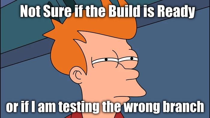
https://www.cryan.com/qa/graphics/2022/BuildReadyMeme.jpg
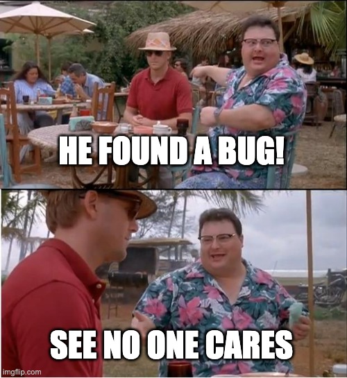
https://www.cryan.com/qa/graphics/2022/FoundBug.jpg

https://www.cryan.com/qa/graphics/2022/DevQACode.jpg
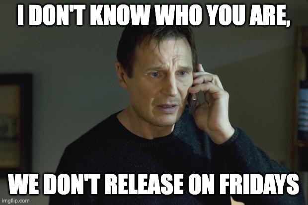
https://www.cryan.com/qa/graphics/2022/NoFridayRelease.jpg
Software Quality Matters

As a professional, it's important to you that the software you use is of the highest quality. But what does that mean, exactly? And how can you be sure your software is up to snuff?
There are a few key things to look for when assessing the quality of software: first, how well does it meet your needs and expectations? Second, how reliable and stable is it? And finally, how well does it perform under pressure?
If a piece of software doesn't meet your needs or expectations, then it's not worth using no matter how high its quality may be. You need something that's going to work for you, not against you. So always test out any new software before committing yourself fully.
Reliability and stability are also key factors in determining quality. Software that crashes or freezes all the time isn't going to do you much good - in fact, it might even end up costing you more in lost productivity than if you'd just gone with a lower-quality option. Make sure to check out reviews online before making your decision; they can be helpful in gauging overall reliability.
About
Welcome to QA!
The purpose of these blog posts is to provide comprehensive insights into Software Quality Assurance testing, addressing everything you ever wanted to know but were afraid to ask.
These posts will cover topics such as the fundamentals of Software Quality Assurance testing, creating test plans, designing test cases, and developing automated tests. Additionally, they will explore best practices for testing and offer tips and tricks to make the process more efficient and effective
Check out all the Blog Posts.
Blog Schedule
| Tuesday | QA |
| Wednesday | Veed |
| Thursday | Business |
| Friday | Macintosh |
| Saturday | Internet Tools |
| Sunday | Open Topic |
| Monday | Media Monday |